- Dive Club
- Posts
- 🤿 garage doors

Too much of designing a startup happens behind closed doors…
So I want to work with the garage door open while building Inflight as much as possible.
You already saw a bunch of the nitty gritty UI details…
But when you’re going 0→1 on something, the storytelling piece is often the hardest part.
So this episode is a sneak peek of a recent presentation we gave in SF (and some behind-the-scenes commentary to go along with it).
Welcome to my garage 👇
🤝 WITH MOBBIN
By now you probably know Mobbin is my absolute go to for product design inspiration 🚀
But they just took their product to the next level by introducing Mobbin Sites

Now they’re also the first place to look for inspiration when designing landing pages, agency portfolios, online storefronts, and a lot more…
I use Mobbin almost every single day and can’t recommend the product enough.
Click the link to explore👇

🔗 FEATURED RESOURCE
Ready to try some new tools?
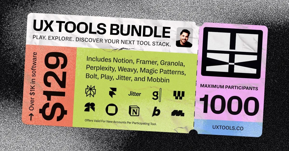
So UX Tools just launched a pretty incredible bundle. This isn’t sponsored, I just consider it my duty to share with you because it’s that good 😅
The bundle is specifically for designers who like to learn by doing. So you can try premium features across the latest AI + design tools for a few months, then decide what belongs in your stack.
For $129 you get ~$9k worth of tools:
Perplexity - Pro plan (6 months)
Framer - 50% off annual Pro plan (12 months)
Jitter - Studio plan (6 months)
Granola - Business/Individual plan (3 months)
Weavy - Starter plan (6 months)
Magic Patterns - Hobby plan (6 months)
Play - Starter plan (6 months)
Notion - Business plan (3 months)
Bolt - Pro plan (6 months)
Mobbin - Pro plan (6 months)
Pretty legit, right? It’s limited to 1,000 slots so I don’t expect it to last long 👇
🔗 FEATURED RESOURCE
What’s next for design tools

Speaking of new tools…
I want to share another article from David Hoang: What’s next for design tools.
David highlights a few themes:
Layout and variation generation (related: demos with MagicPath and Subframe)
The infusion of code with design visual editors (he says there’s no clear winner yet but keep an eye out for a future Dessn episode 😉)
Brand and visual language (he links Phi from Perplexity’s episode about how he was able to use AI to create a unique look)
David also says we’re entering the era of “Bring Your Own Tools” (BYOT):
“The days of mandating a single design tool across an organization are numbered. In the AI-native workplace, the expectation will be Bring Your Own Tools (BYOT). This doesn’t mean chaos—it means respecting how people work best and enabling them to plug into shared systems.
Some designers may thrive in Figma. Others might build custom workflows in Penpot, Utopia, or even script their interface layers using AI and CLI-based tools”
This idea is core to the Inflight vision (and something I wish we would’ve talked about in the pitch video above tbh).
Most days I wake up thinking about “infrastructure that supports diversity in tooling without breaking downstream collaboration” lol.
There’s a lot changing right now and the tooling landscape has never been more exciting :) Which is why it’s a good time to tinker and explore.
🔗 FEATURED RESOURCE
How FB design worked in 2009

This video from 2009 is a time capsule worth saving. It’s a presentation from some of the industry titans:
Kate Aronowitz (Longtime director of design at FB)
Aaron Sittig (OG Design Strategy Lead)
Julie Zhuo (First manager to VP of Product Design)
Soleio (2nd designer and one of my favorite guests)
Adam Mosseri (Now head of Instagram)
The video answers the question: How does a team of twenty-five design for a quarter billion people?
🧃 INSPIRATION JUICE
3 things I saved this week
1️⃣ Conductor terminal UI
Anybody can create something beautiful when you have a bunch of assets and beautiful imagery. But limiting yourself to typography and icons is a tougher test.
That’s why I love this UI from Conductor. Pay attention to the spacing, contrast, type sizes, etc. It’s great work.

2️⃣ Cover photo slot for card UI
I like this portfolio from Daniel—specifically the hover state on these cards.

The UI tilt and animated doodle arrow really create a nice feel and it’s a great initial impression for a hiring manager who is looking to quickly assess your visual chops (see this post for more).
3️⃣ Pricing Page Inspo Gallery
I was working on some simple pricing cards the other day and I wish I would’ve found this resource earlier.

It’s an inspiration gallery specifically for pricing pages. So you’ll definitely want to bookmark this one for later 👇
How much did you enjoy this issue?Never hesitate to reply with feedback too :) |
Meet the Dive partners
I made a list of my favorite products and asked them to come on as sponsors of the newsletter/podcast. They said yes 🥹
The #1 way to support Dive Club is to check them out👇
Framer → How I build my websites
Genway → How I do research
Granola → How I take notes during CRIT
Jitter → How I animate my designs
Lovable → How I build my ideas in code
Mobbin → How I find design inspiration
Paper → How I design like a creative
Raycast → How I stay in flow while I work
Thanks for reading! I'm working hard to bring you the best design resources on the planet 🫶
If you want to go even deeper you can always:
|
P.S. if you were forwarded this email you can subscribe here
